Direction
Quiet, tactile and grounded
This concept leans into a slower rhythm, muted palettes, warm neutrals and a more intimate sense of luxury.
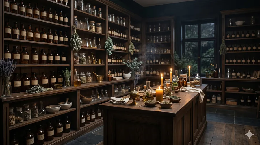
Apothecary Ritual is a softer, moodier website direction created for bath, body, apothecary and slow beauty brands that need more restraint, more calm and a more elevated visual language.
This concept leans into a slower rhythm, muted palettes, warm neutrals and a more intimate sense of luxury.
A good fit for soaps, oils, body care, bath products, apothecary lines and niche wellness brands with thoughtful packaging.
The structure feels calmer and more curated, which helps products feel more intentional and more premium.
The goal here is not loud luxury. It is a slower, more composed visual language that helps the brand feel tactile, refined and worth spending time with.
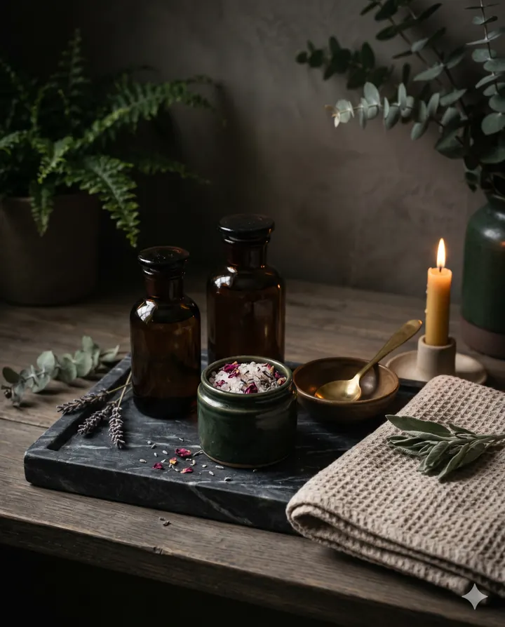
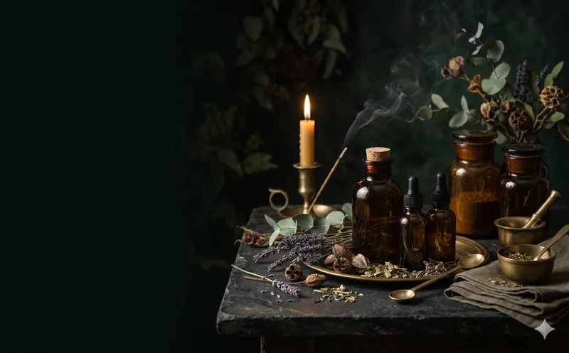
Apothecary Ritual uses darker neutrals, soft gold undertones, dense imagery and more breathing room to build a sense of ritual rather than urgency.
Instead of pushing products like a loud storefront, this direction frames them with more intention — making ingredients, texture and mood feel central to the brand.

Some brands do not need a louder homepage. They need a calmer one — one that gives the customer more confidence, frames the products more carefully and lifts perceived value without forcing it.
If the product already looks considered, the website should stop feeling like the weakest part of the brand.
Wellness, apothecary and ritual products often benefit from more mood, more explanation and less visual pressure.
The overall direction raises perceived quality and helps products feel more deliberate, giftable and elevated.
If your brand already has good product instincts, thoughtful packaging and a quieter premium feel, this kind of direction can translate that into a website that finally feels aligned.