
How a fragrance brand homepage should present scent profiles
Fragrance is difficult to sell online because the most important part of the product cannot be experienced through the screen. A homepage has to translate scent into words, visuals, context and trust. It should not try to describe everything at once, but it should give the visitor enough direction to want to explore.
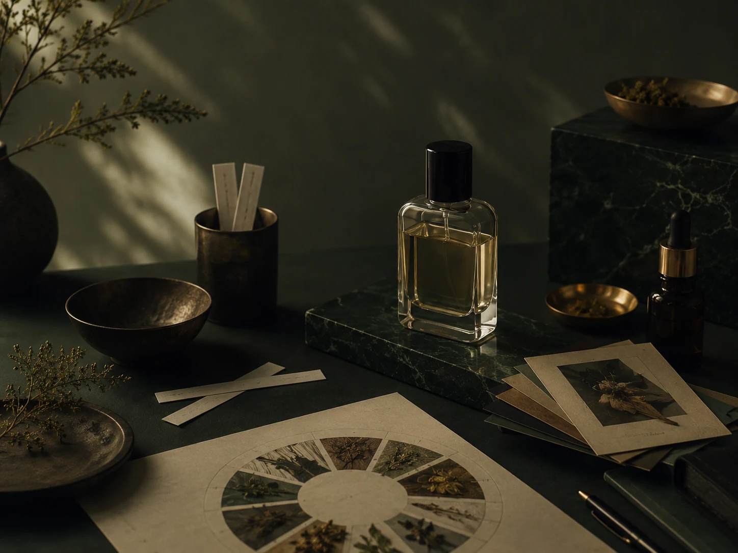
1. Start with the world of the scent
A good fragrance homepage does not begin with a long list of notes. It begins with a world. Is the scent clean, smoky, mineral, green, warm, dry, intimate or bright? That mood helps the visitor understand the product before they read top, heart and base notes.
The scent world can be shown through photography, colour, texture and short copy. A few words can do more than a full paragraph if they are specific. “Warm resin, dry woods and quiet smoke” is more helpful than “a unique luxury fragrance”.
2. Explain notes in human language
Top, heart and base notes are useful, but not every visitor knows how to read them. A list of bergamot, iris, cedar and amber may look elegant, yet it still leaves many people unsure. Add a short human explanation: how it opens, how it settles and what kind of mood it leaves behind.
This is especially important for premium brands. The language should be refined, but not vague. A buyer should feel that the brand understands the scent, not that it is hiding behind abstract words.
3. Connect scent to a real moment
People often buy fragrance for a moment: a daily signature, an evening, a season, a ritual, a gift or a room. A homepage can help by naming those moments. This makes the scent easier to imagine and easier to choose.
Use cases should feel natural, not forced. A small section like “For quiet evenings, close interiors and slow rituals” can make a scent feel more concrete without becoming too commercial.
4. Make sampling visible
For fragrance, the first purchase can feel risky. A discovery set, sample set or small-size entry point can lower that risk. If the brand offers samples, the homepage should not hide them at the bottom of the shop.
Sampling is not only a sales tool. It is also a trust signal. It tells the visitor that the brand understands the hesitation and has created a gentler way to begin.
5. Do not overload the homepage
Fragrance brands often have rich visuals, layered language and many product details. That can become too much quickly. A strong homepage gives the visitor one layer at a time: mood first, then scent logic, then products, then trust.
The page should feel curated. Not every detail belongs above the fold. Some details belong on the product page, some in a discovery section and some in a quiet trust block.
A useful homepage order
- Hero with scent world and one clear CTA
- Featured scent profiles or collection logic
- Discovery set / sample path
- Short trust block: shipping, returns, ingredients, contact
- Brand story with restraint
- Product section or bestsellers
- Final CTA to explore or sample
How to use this in practice
Do not treat this as a cosmetic checklist. A premium product website works when the visitor understands what is being sold, why it matters, how to trust the brand and what to do next. Before changing colours or fonts, read the page as if you were a first-time buyer who has never seen the brand on Instagram.
Look for missing context. If the page assumes the visitor already knows the product, the material, the process, the size, the scent family or the buying steps, the page is doing too little. A good website should reduce hesitation without becoming loud or over-explained.
A simple order for improvements
- Clarify the headline so the visitor knows what the brand sells within a few seconds.
- Move trust signals closer to the first buying or enquiry decision.
- Use one clear next step instead of sending people in several directions at once.
- Replace vague claims with concrete details about materials, process, delivery or care.
- Make sure mobile visitors see the key message before they need to scroll too far.
Small brands often try to make every page beautiful before making it clear. The better order is clarity first, trust second and atmosphere third. When those three things work together, the website starts to support the perceived quality of the product instead of weakening it.
What to review every quarter
Every few months, check whether the page still matches the direction of the brand. Product lines change, photography improves, pricing evolves and the level of trust needed by a buyer also changes. If the website still sounds like the brand from six months ago, it may quietly be holding back a stronger offer.
Related next step
Send your current website or product page. I will reply with three practical fixes for clarity, trust and a more premium presentation.