
Homepage trust checklist for product brands
Trust is not only built at checkout. For many product brands, trust starts on the homepage. Before someone reads a full product page, they already decide whether the brand feels careful, real and worth their time. A few small homepage details can change that feeling quickly.
1. Say what the brand sells clearly
A beautiful headline is not enough if the visitor cannot understand the offer. The homepage should quickly show the product category, the mood and the best next step. This sounds simple, but many premium brands become vague because they try to sound elevated.
Clear does not mean plain. It means the visitor does not have to guess.
2. Show that real people are behind the brand
Small brands often hide the most human part of the business. A founder note, studio detail, process photo or short story can make the brand feel more real. This is especially useful when the product is handmade, small-batch or visually premium.
The point is not to overshare. The point is to reduce distance.
3. Put practical reassurance near product paths
Shipping, returns, care, sizing, ingredients and contact should not be hidden. They do not all need to be large sections, but they should appear near the moments where the visitor may hesitate.
A trust detail is strongest when it answers a question at the right time.
4. Use proof carefully
Reviews, press, stockists, customer photos and case studies are useful, but only if they support a decision. A random wall of logos can feel empty. A short quote placed near the right section can feel much stronger.
For early brands, even one honest recommendation is better than ten vague claims.
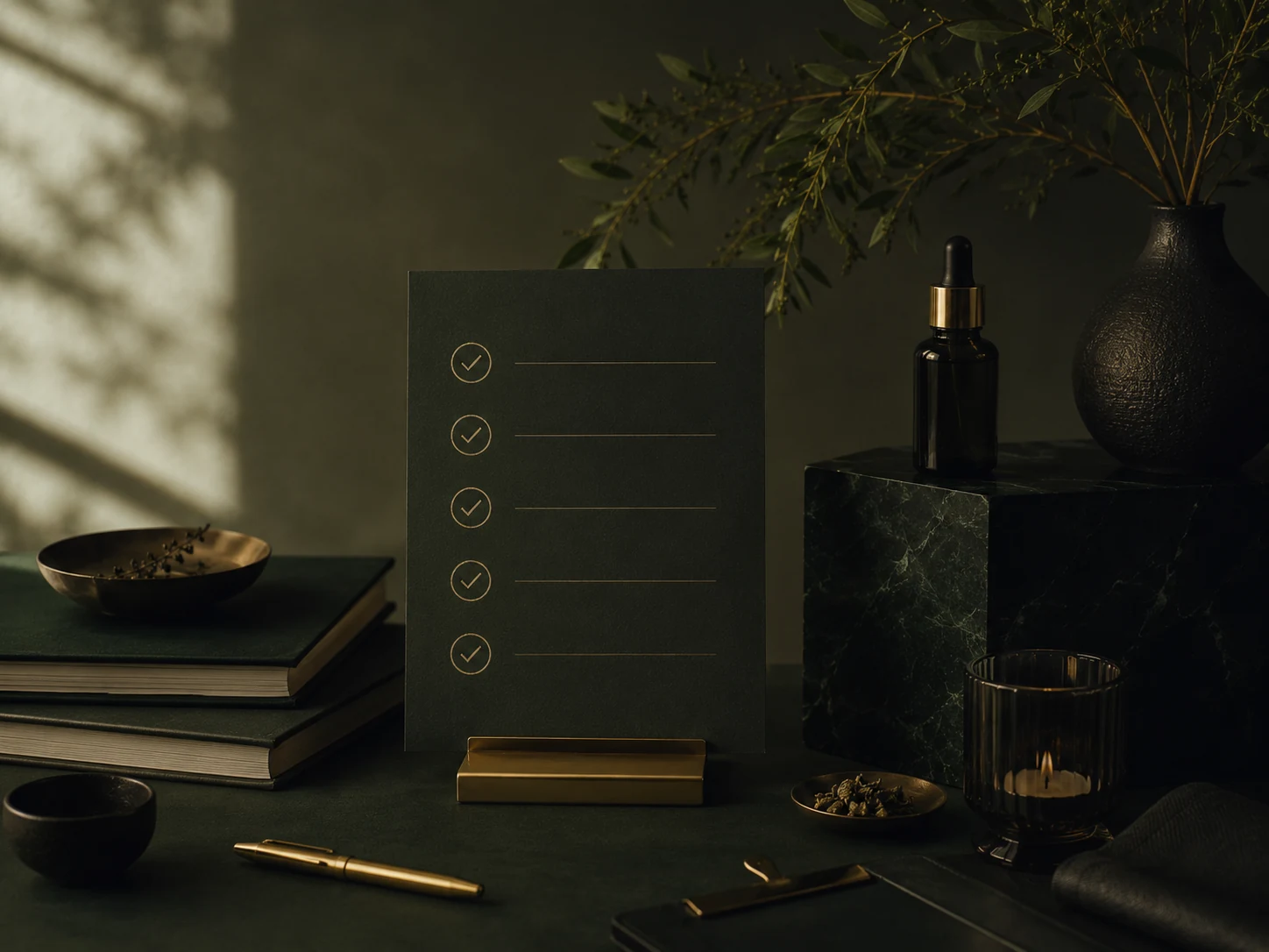
Quick homepage trust checklist
- Clear product category above the fold
- One main CTA, not five competing buttons
- Visible shipping or delivery reassurance
- Reviews or public recommendations
- Founder, studio or process context
- Easy way to contact the brand
- Consistent visuals from hero to footer
How to use this in practice
Do not treat this as a cosmetic checklist. A premium product website works when the visitor understands what is being sold, why it matters, how to trust the brand and what to do next. Before changing colours or fonts, read the page as if you were a first-time buyer who has never seen the brand on Instagram.
Look for missing context. If the page assumes the visitor already knows the product, the material, the process, the size, the scent family or the buying steps, the page is doing too little. A good website should reduce hesitation without becoming loud or over-explained.
A simple order for improvements
- Clarify the headline so the visitor knows what the brand sells within a few seconds.
- Move trust signals closer to the first buying or enquiry decision.
- Use one clear next step instead of sending people in several directions at once.
- Replace vague claims with concrete details about materials, process, delivery or care.
- Make sure mobile visitors see the key message before they need to scroll too far.
Small brands often try to make every page beautiful before making it clear. The better order is clarity first, trust second and atmosphere third. When those three things work together, the website starts to support the perceived quality of the product instead of weakening it.
What to review every quarter
Every few months, check whether the page still matches the direction of the brand. Product lines change, photography improves, pricing evolves and the level of trust needed by a buyer also changes. If the website still sounds like the brand from six months ago, it may quietly be holding back a stronger offer.
A simple before and after example
Before the update, the page may only say what the brand offers. After the update, it should also show why the offer is credible. For example, a candle brand should not only say “hand-poured candles”. It should explain wax type, scent strength, burn time, vessel size, care instructions and the mood of each collection. A jewellery brand should not only say “minimal handmade jewellery”. It should show scale, material, finish, packaging, lead time and care. Those details are not clutter when they are organised well. They are the proof that supports the premium impression.
Related next step
Send your current website or product page. I will reply with three practical fixes for clarity, trust and a more premium presentation.