
Website checklist for candle brands
A candle website has a difficult job. It has to sell something the visitor cannot smell yet. A product grid alone rarely does that well. The page has to give enough atmosphere to make the candle desirable, enough clarity to make the choice easy and enough trust to make the purchase feel safe.
1. Start with mood, but do not hide the product
The first screen should quickly answer three things: what you sell, what the mood feels like and what the visitor should do next. A candle brand can be poetic, but the homepage cannot be vague. If the hero only shows a pretty room or a close-up flame without product context, the page feels atmospheric but unclear.
A better hero combines mood with a clear product direction: a collection name, a short scent world, a visible candle or gift set and one calm CTA. The goal is not to explain every product immediately. The goal is to make the visitor feel oriented.
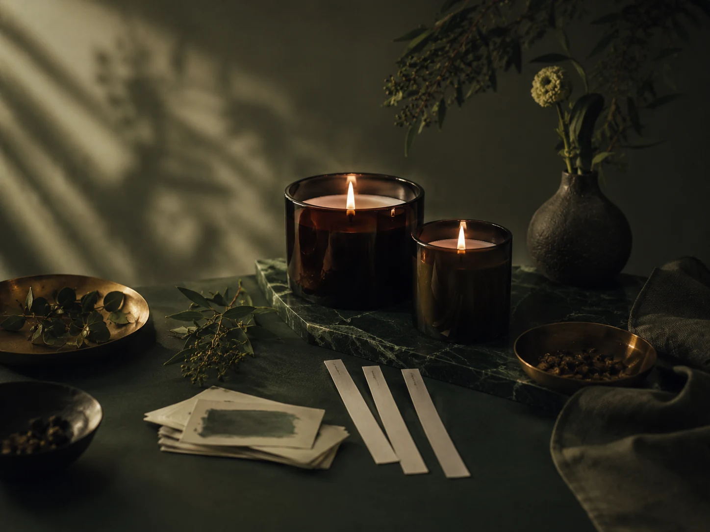
2. Organise scents in a way people can actually use
People do not always shop by candle name. They shop by feeling, room, season, intensity or gift situation. If every candle is presented in the same way, the visitor has to work too hard. Help them choose with scent families, short descriptions and simple paths like fresh, warm, woody, floral or evening.
This does not mean the page needs a complex filtering system. Even a small section with scent families can make the brand feel more thoughtful. It also reduces the risk that a visitor leaves because everything sounds beautiful but nothing feels easy to compare.
3. Build trust before the buy button
Candles are sensory, but trust is still practical. Visitors want to know burn time, wax type, wick type, size, care instructions, shipping, returns and safety notes. These details do not need to dominate the design, but they need to be easy to find.
A premium page does not hide useful information. It presents it calmly. Short trust blocks, product care notes and shipping clarity can make a small brand feel more reliable without making the site feel corporate.
4. Treat gifts as a real buying path
Candle brands often sell well as gifts, but many websites hide gifting inside the product grid. If gifting matters, show it as a path. Gift sets, bestsellers, seasonal bundles and “safe first choice” products should be easy to find.
A visitor buying for someone else needs confidence quickly. They may not know the scent profile, but they can respond to clear guidance: best for a calm evening, best for a new home, best for warm interiors, best as a small thank-you.
5. A simple homepage order that works
A candle homepage does not need to be complicated. A strong order is: hero with product and mood, scent families, bestsellers or discovery set, trust details, brand story, gift path and final CTA. This structure gives the visitor enough emotion and enough practical information.
The mistake is usually not a lack of design. It is a lack of order. When the page jumps from mood to products to story to more products without a clear reason, it starts to feel like a catalogue instead of a brand experience.
Quick checklist
- Clear product and mood above the fold
- Scent families or simple discovery paths
- Burn time, wax, wick and care information
- Gift sets or best first choices
- Visible shipping and return clarity
- A final CTA that does not feel pushy
How to use this in practice
Do not treat this as a cosmetic checklist. A premium product website works when the visitor understands what is being sold, why it matters, how to trust the brand and what to do next. Before changing colours or fonts, read the page as if you were a first-time buyer who has never seen the brand on Instagram.
Look for missing context. If the page assumes the visitor already knows the product, the material, the process, the size, the scent family or the buying steps, the page is doing too little. A good website should reduce hesitation without becoming loud or over-explained.
A simple order for improvements
- Clarify the headline so the visitor knows what the brand sells within a few seconds.
- Move trust signals closer to the first buying or enquiry decision.
- Use one clear next step instead of sending people in several directions at once.
- Replace vague claims with concrete details about materials, process, delivery or care.
- Make sure mobile visitors see the key message before they need to scroll too far.
Small brands often try to make every page beautiful before making it clear. The better order is clarity first, trust second and atmosphere third. When those three things work together, the website starts to support the perceived quality of the product instead of weakening it.
What to review every quarter
Every few months, check whether the page still matches the direction of the brand. Product lines change, photography improves, pricing evolves and the level of trust needed by a buyer also changes. If the website still sounds like the brand from six months ago, it may quietly be holding back a stronger offer.
Related next step
Send your current website or product page. I will reply with three practical fixes for clarity, trust and a more premium presentation.