
Why your product looks premium on Instagram but not on your website
Many product brands look stronger on Instagram than on their own website. The photos are beautiful, the packaging feels considered and the feed creates a clear mood. Then the visitor taps the link in bio and lands on a page that feels flatter, busier or less confident. The problem is rarely the product. It is usually the structure around the product.
1. Instagram sells mood, your website has to build confidence
Instagram is very good at showing mood. A feed can make a candle, fragrance or artwork feel desirable in seconds. But a website has to do more. It has to explain, compare, answer questions and guide someone toward a decision.
When the website only repeats the mood from Instagram, it often feels thin. When it adds structure and trust, the same product starts to feel more serious.
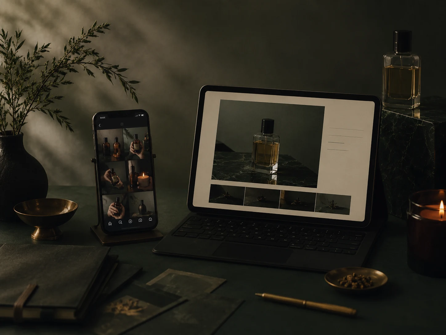
2. Pretty images need hierarchy
A page can have great photos and still feel weak if every image has the same weight. The visitor needs to know what matters first, what is a collection, what is a best first choice and where to go next.
Hierarchy is what turns beautiful content into a usable page. It gives the visitor a path instead of making them scroll through decoration.
3. Your website needs proof, not just polish
Premium is not only an aesthetic. It is also the feeling that the brand knows what it is doing. Reviews, clear process, shipping information, product care, ingredients, sizing, materials or commission details all make the product feel safer.
This is where many Instagram-strong brands lose people. The feed creates desire, but the page does not remove doubt.
4. Make the handoff from social media intentional
A visitor coming from Instagram does not need a completely cold introduction. They already saw a product or a post. Your page should continue that story and help them take the next step: explore the collection, understand the product, request a review, order samples or enquire.
The transition should feel like entering a calmer, more complete version of the brand. Not a different brand. Not a weaker brand.
What to fix first
- Make the homepage headline more specific
- Choose one main product path instead of five equal choices
- Add trust details close to the first product section
- Use social proof where it naturally supports a decision
- Keep the visual mood, but reduce clutter
How to use this in practice
Do not treat this as a cosmetic checklist. A premium product website works when the visitor understands what is being sold, why it matters, how to trust the brand and what to do next. Before changing colours or fonts, read the page as if you were a first-time buyer who has never seen the brand on Instagram.
Look for missing context. If the page assumes the visitor already knows the product, the material, the process, the size, the scent family or the buying steps, the page is doing too little. A good website should reduce hesitation without becoming loud or over-explained.
A simple order for improvements
- Clarify the headline so the visitor knows what the brand sells within a few seconds.
- Move trust signals closer to the first buying or enquiry decision.
- Use one clear next step instead of sending people in several directions at once.
- Replace vague claims with concrete details about materials, process, delivery or care.
- Make sure mobile visitors see the key message before they need to scroll too far.
Small brands often try to make every page beautiful before making it clear. The better order is clarity first, trust second and atmosphere third. When those three things work together, the website starts to support the perceived quality of the product instead of weakening it.
What to review every quarter
Every few months, check whether the page still matches the direction of the brand. Product lines change, photography improves, pricing evolves and the level of trust needed by a buyer also changes. If the website still sounds like the brand from six months ago, it may quietly be holding back a stronger offer.
Related next step
Send your current website or product page. I will reply with three practical fixes for clarity, trust and a more premium presentation.